Anthropic’s partner list turns into a map
I break down Anthropic’s Partnerbase partner list into a practical way to map ecosystem fit and build your own partner tracker.

This breaks Anthropic’s partner list into a usable ecosystem-mapping template.
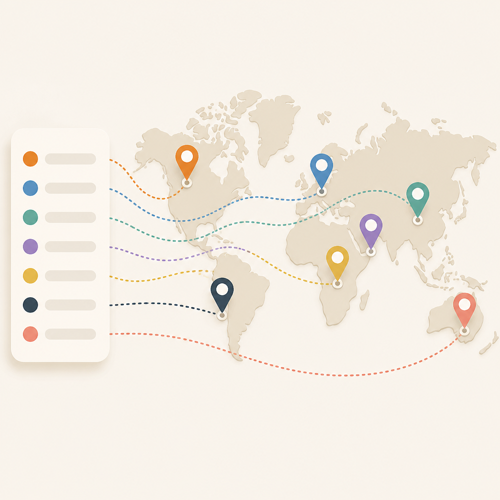
I’ve been using partner directories like this for years, and they usually feel half-useful. You get a giant list of logos, a few vague labels, and then you’re supposed to magically understand the business strategy. That never worked for me. I’d look at a page like Anthropic’s Partnerbase profile, see 210 partners, and still not know what to do next. Is this a channel motion? A product integration map? A customer success signal? A bunch of all of the above? The page gives you data, sure, but not a workflow.
What finally clicked for me was treating partner lists less like a directory and more like a diagnostic. Once I stopped asking “who are they partnered with?” and started asking “what kind of ecosystem are they building?” the whole thing got useful. Anthropic’s page on Partnerbase gave me exactly that nudge. It’s not a polished narrative from Anthropic. It’s a scraped, structured partner graph with enough texture to reverse-engineer the motion.
That’s the angle I’m breaking down here: how I read the page, what the partner mix suggests, and how I’d turn the same idea into a tracker for my own company or product.
Stop reading partner pages like a brochure
Get the latest AI news in your inbox
Weekly picks of model releases, tools, and deep dives — no spam, unsubscribe anytime.
No spam. Unsubscribe at any time.
Anthropic has 210 technology and channel partnerships tracked on Partnerbase.
What this actually means is that the page is telling you scale before it tells you strategy. That number matters because it changes how I interpret the rest of the list. Ten partners can be a few hand-picked integrations. Two hundred and ten usually means a broader ecosystem play, or at least a lot of surface area being tracked.
I’ve made the mistake of reading partner directories as if every entry had equal weight. That’s nonsense. A partner list is usually a mix of real integrations, co-marketing relationships, agencies, resellers, and one-off observations. If you don’t separate those buckets, you end up with a fake picture of the company.
On Anthropic’s page, Partnerbase explicitly labels the company type and shows observations per partner. That’s a clue. It tells me this isn’t just “who they love.” It’s “what external relationships are visible enough to be tracked.” That distinction saves me from over-reading the list.
How I apply it:
- Start by treating the total count as a rough signal, not a proof of strategy.
- Separate technology partners from channel partners and generic relationships.
- Ask which entries look like product integrations, which look like services, and which look like distribution.
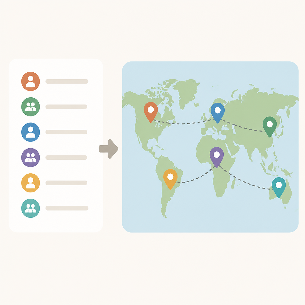
If I were building a competitor brief, I’d never paste the list into a slide and call it analysis. I’d tag each partner by motion first. That’s the only way the data becomes usable.
The mix tells you what Anthropic is optimizing for
Some of Anthropic’s partners include Happenstance, Wispr AI, Softr, Social Intents, and Heartex.
What this actually means is that the partner set is broad enough to suggest ecosystem spread rather than one narrow integration lane. You’ve got workflow tools, AI-adjacent products, no-code tooling, customer support software, and data/labeling infrastructure in the same neighborhood. That’s not random. It tells me Anthropic is visible across multiple buyer workflows.
I’m not claiming every one of those relationships is a deep technical integration. Partnerbase doesn’t say that, and I’m not going to invent it. But the categories matter. Wispr AI points to productivity and voice. Softr points to no-code app building. Social Intents points to customer-facing support workflows. Heartex points to data labeling and model operations. That’s a pretty wide surface area.
I’ve seen this pattern before with companies that want to be embedded everywhere a user might touch AI. The partner list becomes a map of where the product can show up without forcing the user into a single workflow. That’s a very different posture from “we only integrate with the top five tools.”
How I apply it:
- Group partners by user job, not just by company type.
- Look for repeated adjacency around support, content, automation, and data workflows.
- Use the mix to guess where the company wants distribution.
If I were a founder, I’d ask a brutal question here: which part of my product is actually worth partnering around? Because if the list is broad but shallow, that’s a different story than broad and sticky.
Observation counts are the part people ignore
Wispr AI shows 4 observations, Bounteous shows 11 observations, and Dagster Labs shows 4 observations.
What this actually means is that Partnerbase isn’t just listing names; it’s hinting at evidence density. More observations usually means more signals were found around that partner relationship. That doesn’t automatically mean the relationship is deeper, but it does mean the partnership is more visible in the data.
This is where I stop being impressed by the logo wall and start caring about the metadata. A partner with 11 observations is different from one with 1 observation. Maybe it’s because the company is bigger, maybe because it’s more public, maybe because the relationship is easier to detect. Either way, the count helps me prioritize what to inspect first.
I ran into this exact problem while building internal partner research. If I only looked at the names, I spent too much time on dead ends. Once I sorted by evidence count, I got a much better triage list. The partners with repeated observations were usually the ones worth checking for blog posts, integrations, marketplace listings, or co-sell motion.
How I apply it:
- Sort partners by observation count before you do any manual review.
- Use high-observation entries as starting points for deeper validation.
- Don’t assume low-observation entries are unimportant; just treat them as weaker evidence.
There’s a practical side effect here too. If you’re building your own partner tracker, evidence count gives you a ranking system without needing a fancy model. That’s useful when you’re staring at a spreadsheet and trying not to lose your mind.
Channel and technology partners are not the same animal
Partnerbase labels Anthropic’s ecosystem as 210 technology and channel partnerships.
What this actually means is that the page is mixing two very different kinds of relationships. Technology partnerships usually imply product adjacency. Channel partnerships usually imply distribution, services, implementation, or go-to-market support. If I blur those together, I end up with a fake understanding of the company’s motion.
I’ve watched teams make this mistake in due diligence. They see a big partner count and assume product maturity. But a long channel list can just mean the company is good at ecosystem selling. That’s valuable, but it’s not the same thing as deep integration coverage.
For Anthropic, this distinction matters because the brand sits in a part of the market where people constantly over-interpret signals. A channel-heavy ecosystem can make a company look more embedded than it really is. A tech-heavy ecosystem can make a company look more integrated than it really is. The label matters.
How I apply it:
- Build two columns in your tracker: technology and channel.
- Use different questions for each. For tech: what does the integration do? For channel: who is selling, implementing, or supporting?
- Never combine them into one “partner” score unless you also keep the subtype.
If you’re doing competitive research, this is the first filter I’d add. It keeps the analysis honest.
The page is really a workflow for finding adjacent companies
Need to track Anthropic or find similar companies at scale? Use Trace for saved lists, company monitoring, and richer firmographic and technographic filters.
What this actually means is that Partnerbase is not just trying to inform you about Anthropic. It’s trying to funnel you into a list-building workflow. The page is basically saying: take this partner graph and use it as a seed for monitoring, segmentation, and lookalike discovery.
That’s the part I actually respect. The raw directory is useful, but the real value is in the workflow around it. Partnerbase points to Trace, which is where the saved lists and tracking live. That tells me the public page is the top of the funnel, not the end product.
I’ve built enough internal tooling to know why this matters. A static partner page gets stale fast. A monitored list lets you answer better questions over time: Which partners are new? Which ones disappeared? Which categories are growing? Which companies resemble Anthropic’s ecosystem pattern?
How I apply it:
- Use the public partner page as a seed list.
- Move anything interesting into a monitored tracker.
- Add firmographic and technographic filters so the list becomes searchable instead of decorative.
If I were doing this for my own product, I’d use the partner list as an input into account targeting. Not because every partner is a prospect, but because the ecosystem tells me where the product already has gravity.
What I’d actually do with this data tomorrow
Partnerbase shows Anthropic with 210 tracked partners and a public ecosystem graph.
What this actually means is that I can turn a public partner directory into a working research system. I don’t need perfect data. I need a repeatable way to classify, rank, and revisit relationships.
Here’s the process I’d use if I were starting from scratch. First, export the visible partner names. Second, tag them by motion: tech, channel, services, generic. Third, tag by product adjacency: support, no-code, data, workflow, productivity, security, or infrastructure. Fourth, sort by observation count. Fifth, mark which ones have obvious public proof like marketplace pages, integration docs, or partner announcements.
That gives me something much better than a raw list. It gives me a map I can actually work from. And once I have that, I can compare Anthropic’s ecosystem against other AI companies without pretending every partnership means the same thing.
How I apply it in practice:
- Use a spreadsheet first, not a database. Keep the process dumb until it proves useful.
- Add columns for partner type, evidence count, adjacency, and public proof.
- Review the top 20 entries before you try to analyze the whole list.
If you want the shortest version of my advice, it’s this: don’t worship the partner count. Use it to build a better question.
The template you can copy
# Partner ecosystem tracker template

Company: [Target company]
Source: [Public partner directory URL]
Date reviewed: [YYYY-MM-DD]

## Step 1: Capture the raw list
- Partner name
- Source URL
- Listed company type
- Observation count
- Any visible notes

## Step 2: Tag each partner
- Motion: technology / channel / services / generic
- Adjacency: support / no-code / data / productivity / security / infrastructure / other
- Evidence level: high / medium / low
- Public proof: docs / marketplace / announcement / case study / none

## Step 3: Rank for review
- Sort by observation count
- Prioritize high-evidence entries
- Flag repeated categories

## Step 4: Turn it into action
- What partners look like real integrations?
- What partners look like distribution?
- What categories repeat most?
- What companies resemble this ecosystem pattern?

## Example spreadsheet columns
Partner Name | Motion | Adjacency | Observation Count | Public Proof | Notes | Follow-up

## Review prompt
For each partner, answer:
1. What kind of relationship is this?
2. What product workflow does it touch?
3. Is there public proof?
4. Does this look like a one-off or a repeatable pattern?
5. What should I verify next?

## Simple scoring
- 3 points: clear public proof
- 2 points: repeated observations
- 2 points: strong product adjacency
- 1 point: likely distribution or channel relevance
- 1 point: fits a repeated ecosystem pattern

## Output
- Top 10 partners to investigate
- Top 3 partner categories
- 3 ecosystem hypotheses
- 1 list of lookalike companies to research
That’s the version I’d actually use. It’s plain, a little boring, and way more useful than a slide deck full of logos.
Source attribution: The original directory is on Partnerbase’s Anthropic page. Everything above is my read of that public data, not an official Anthropic statement.
// Related Articles
- [TOOLS]
CCCL Runtime makes CUDA safer by making state explicit
- [TOOLS]
35 NVIDIA AI supercomputers turn Europe into a lab
- [TOOLS]
Devin AI Review 2026: Benchmarks, Pricing & Tests
- [TOOLS]
Rust+ Desktop proves unofficial tools can be safer than closed ones
- [TOOLS]
Libghostty is becoming the terminal substrate for agent workflows
- [TOOLS]
OpenAI Pre-IPO Access via IPO CLUB