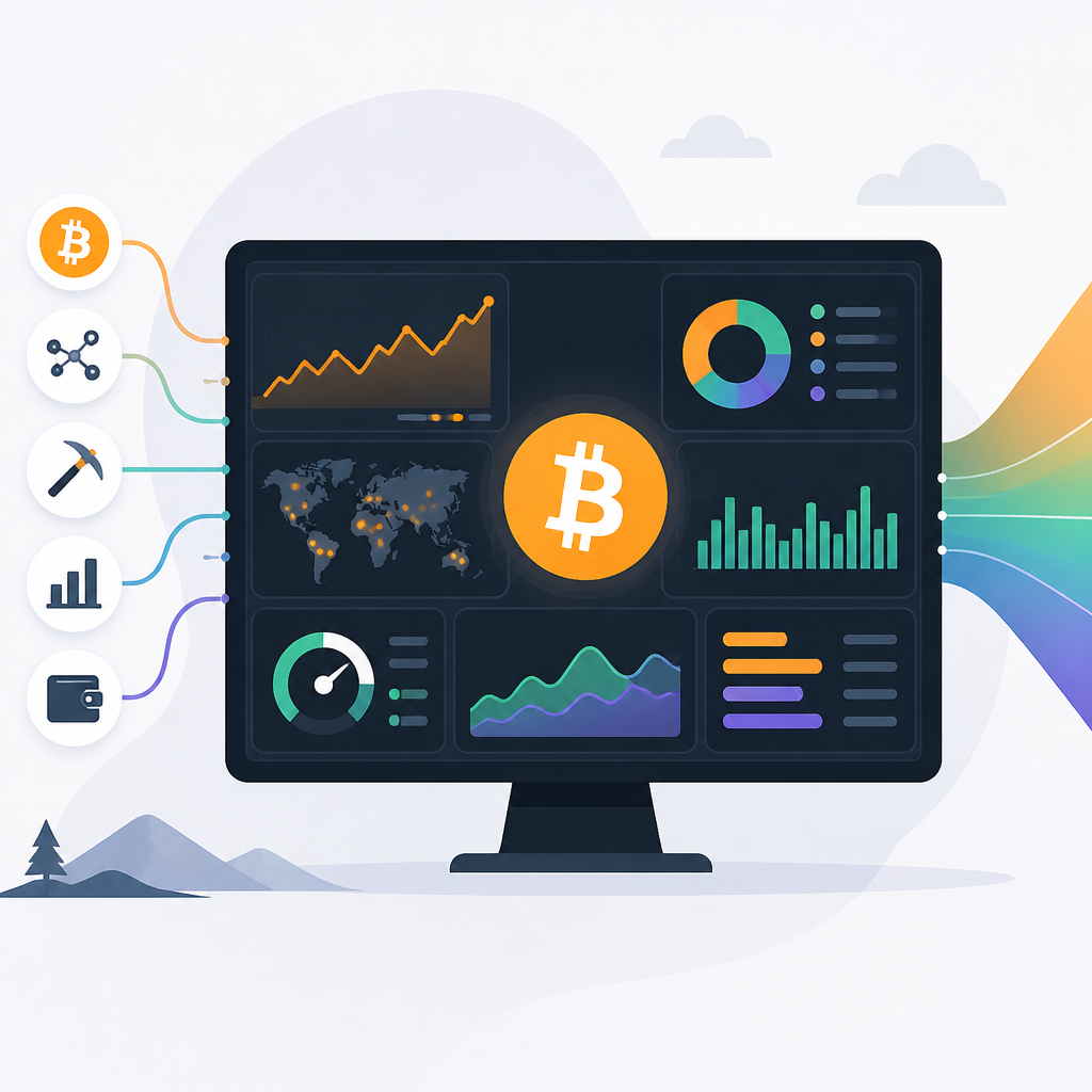
Newhedge turns Bitcoin data into one live dashboard
4 ways Newhedge helps you track Bitcoin price, on-chain signals, macro data, and ETF flows in one live dashboard.

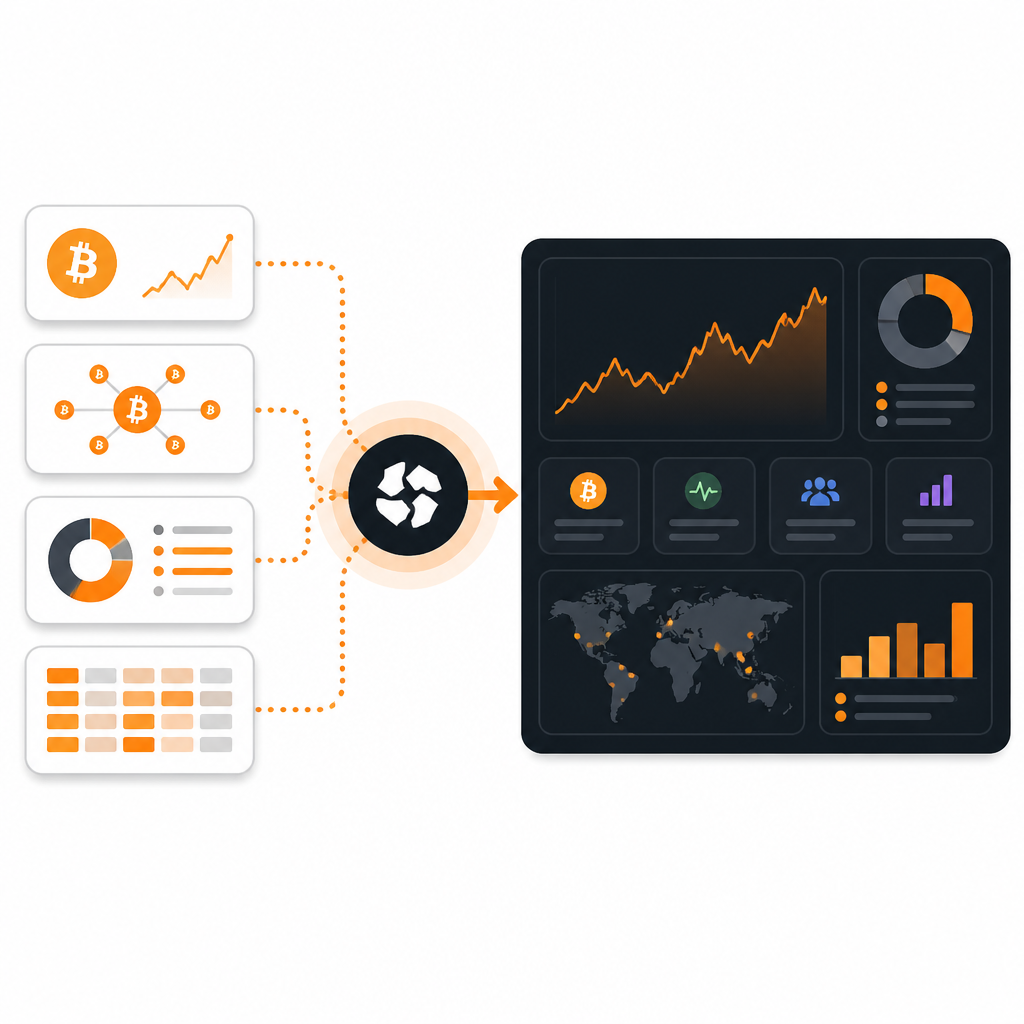
Newhedge combines Bitcoin price, on-chain metrics, macro data, and ETF flows in one live dashboard.
Newhedge’s Bitcoin page pulls together more than 200 metrics, so you can scan price, network health, and macro signals without bouncing between tabs.
| Item | What it tracks | Best for |
|---|---|---|
| Live price | Bitcoin price, market cap, realized market cap | Fast market checks |
| On-chain data | Addresses, UTXOs, supply, MVRV, SOPR | Network and holder analysis |
| Macro signals | Treasury yields, M2, Fed liquidity, inflation | Cross-asset context |
| ETF tracker | Flows, AUM, volumes, market share | Institutional demand watch |
1. Live price and market stats
Get the latest AI news in your inbox
Weekly picks of model releases, tools, and deep dives — no spam, unsubscribe anytime.
No spam. Unsubscribe at any time.
The Newhedge Bitcoin dashboard starts with the basics most traders want first: live price, market cap, capitalization growth rate, and related performance views. That makes it useful as a quick opening tab before you move into deeper analysis.
Instead of treating price as a single number, the page connects it to time series and momentum tools. You can check whether the market is trending, cooling off, or reacting to a broader move.
- Bitcoin Live Price
- Bitcoin Market Cap
- Bitcoin Capitalization Growth Rate
- Daily, weekly, monthly, and yearly price performance
2. On-chain activity and holder behavior
If you care about what Bitcoin users and holders are doing, this is where the dashboard gets more interesting. Newhedge groups metrics for addresses, UTXOs, supply, realized value, and profit-loss behavior, which helps you see whether activity is broadening or slowing.
That mix is handy for reading market structure, not just price. A rising live chart can look very different when active addresses, transaction counts, or supply in profit are moving the other way.
Examples: Active Addresses, UTXO Count, Bitcoin MVRV Ratio, Bitcoin SOPR, Bitcoin NUPL3. Macro indicators tied to Bitcoin
Newhedge also gives Bitcoin a macro backdrop. The dashboard includes Treasury yields, real yields, Fed liquidity, inflation series, credit spreads, and M2-related charts, which makes it easier to compare Bitcoin with the policy cycle.
This is the section to use when you want context beyond crypto-native indicators. It helps answer whether Bitcoin is moving with liquidity, rates, or risk sentiment across traditional markets.
- 10-Year Treasury Yield
- Fed Net Liquidity
- Bitcoin vs Global M2 Supply Growth
- VIX and inflation price indexes
4. ETF flows and institutional demand
The ETF area is one of the clearest signs that Newhedge is built for current Bitcoin market analysis, not just historical charts. You can track cumulative flows, daily AUM, trading volumes, and market share across spot ETFs and futures-linked products.
For investors watching adoption from bigger allocators, this section gives a practical read on demand. Flows can confirm a price move, or show that the move is happening without much ETF support.
- Bitcoin ETF Tracker
- ETF Flows [USD]
- ETF Flows [BTC]
- Total Net Flows
5. Mining, supply, and network health
Mining and network sections round out the picture by showing how secure and active the network looks. You get difficulty, hashrate, block timing, mining pool dominance, and miner revenue, plus supply and transaction views that help you judge stress or expansion.
That makes the dashboard useful for longer-term Bitcoin users who want to connect issuance, miner economics, and network usage in one place. It is less about headlines and more about whether the system is healthy underneath the chart.
Useful checks: Bitcoin Difficulty, Bitcoin Hashrate, Bitcoin Block Time (Speed), Bitcoin Miner Revenue, Bitcoin Transaction VolumeWhat to pick
Pick Newhedge if you want one Bitcoin page that covers price, on-chain behavior, macro context, and ETF demand without stitching together separate tools. It is especially good for readers who want a quick scan first and deeper charts second.
If you only need a price ticker, it is more than you need. If you want a live research hub for Bitcoin, this dashboard gives you a lot of signal in one place.
// Related Articles
- [CHAIN]
AI in Crypto: agents, tokens, and use cases explained
- [CHAIN]
Immutable X cuts NFT game fees on Ethereum
- [CHAIN]
Ethereum Rises on L2 Activity and Staking
- [CHAIN]
Six Layer 2 Picks That Matter in Q3 2026
- [CHAIN]
AI agents in Web3 need strict controls, not hype
- [CHAIN]
DeFi’s crash problem gets a cleaner fix