Kimi K2.6 turns a prompt into brand sites
I break down how Kimi K2.6 maps a single prompt into a cinematic brand site, and give you a copy-ready template.

Kimi K2.6 turns one prompt into a cinematic brand site instead of a static mockup.
I've been using AI design tools long enough to know when something feels genuinely useful and when it just feels like another demo with nice lighting. Lately, a lot of these tools have been doing the same trick: make a pretty hero section, toss in some motion, sprinkle in a few gradients, and act like the job is done. It isn't. The hard part has always been the same boring stuff: keeping the brand consistent, making the layout feel intentional, and not ending up with a page that looks like it was assembled by a very confident intern at 2 a.m.
That’s why the Kimi K2.6 post on Zhihu caught my attention. The claim is not just “generate an image” or “make a landing page.” It’s closer to: give it a sentence, and it can spit out a cinematic, dynamic brand website. That’s a much more interesting problem, because once the model starts thinking in site structure instead of isolated visuals, you can actually use it for work instead of screenshots.
And yes, the comparison to Claude Design is doing a lot of work here. I get why people are making it. The thing everyone remembers from these tools is not the pixels; it's the feeling that the whole page was composed, not just generated. That’s the bar now. If Kimi K2.6 can hit that bar in a way that feels usable for product teams and brand teams, then I care. If it only makes pretty noise, I don’t.
It’s not about images, it’s about page intent
Get the latest AI news in your inbox
Weekly picks of model releases, tools, and deep dives — no spam, unsubscribe anytime.
No spam. Unsubscribe at any time.
“一句话生成电影级的动态品牌网站”
What this actually means is the model is being judged on whether it can turn a prompt into a page with a point of view. Not a collage. Not a random hero with a button. A page that looks like someone thought about hierarchy, motion, and brand tone before they touched the layout.
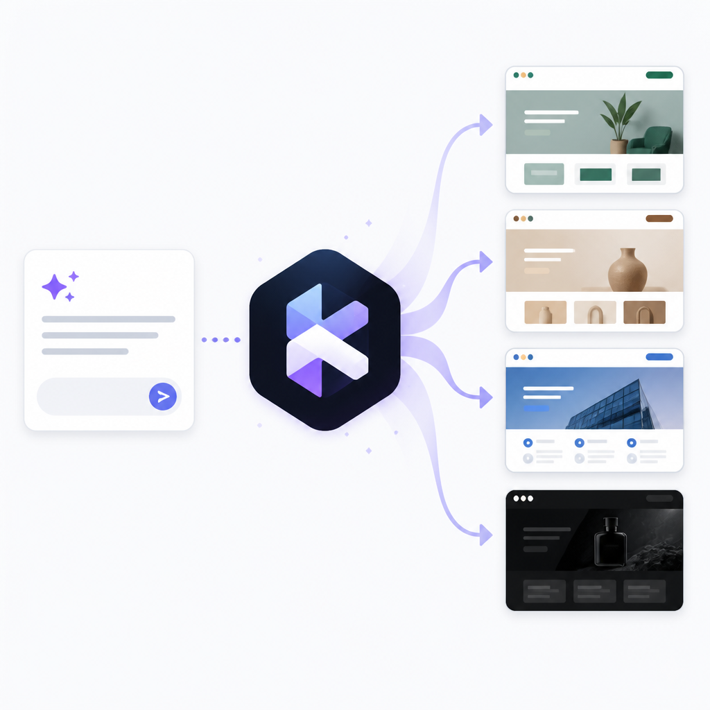
I’ve seen this failure mode over and over. Teams ask for “AI-generated design” and what they get back is a pretty header, a vague CTA, and a footer that looks like it wandered in from another project. The visuals are fine. The composition is the problem. If the model can’t decide what matters first, the whole thing feels fake.
What I like about the framing in the Zhihu post is that it forces the model to do more than decorate. A brand site has to signal who it is, what it does, and why the motion exists at all. That’s a much better test than asking for a single poster or one hero image.
How to apply it: when you prompt a tool like this, stop asking for “a beautiful landing page.” Ask for the page’s job. Who is it for? What should the first screen communicate? What should move, and why? If you can’t answer that, the model will usually fill the gap with generic polish.
The Claude Design comparison is about workflow, not hype
The post frames Kimi K2.6 against Claude's design-oriented output, and that comparison makes sense only if you think about the workflow. The win is not “it can generate art.” The win is “it can reduce the distance between a rough idea and a usable page.”
I’ve been burned by tools that look amazing for five minutes and then collapse the moment you need iteration. The first draft is easy. The second draft is where the truth shows up. Can you change the tone without wrecking the layout? Can you make it more premium without making it colder? Can you swap the product angle without rebuilding the whole thing?
That’s where design-gen tools usually fall apart. They are good at output, bad at continuity. If Kimi K2.6 is being compared to Claude Design, I’m reading that as a claim about continuity: the model can keep the design language intact while the content changes.
- First draft speed matters, but iteration speed matters more.
- A good design model should preserve structure when the prompt shifts.
- If every edit restarts the layout, the tool is just a screenshot machine.
How to apply it: test any of these tools with three prompt changes in a row. Keep the brand the same, then change the audience, then change the product angle. If the result still feels like one system, you’ve got something worth using. If not, you’ve got a toy.
Dynamic brand sites need motion with a job
“动态” gets thrown around a lot, and most of the time it means unnecessary motion. I’m talking about motion that helps the page explain itself. That could be a scroll transition that reveals a product story, a subtle parallax that supports depth, or animated type that reinforces tone. It should not be animation for the sake of looking expensive.

I ran into this exact issue when I was prototyping a launch page for a small product team. The generated mockups looked slick, but every animation fought the copy. The motion was louder than the message. Users don’t care that your hero section can spin, blur, and fade if they still don’t know what you sell.
If Kimi K2.6 is useful here, it’s because it can produce motion as part of the composition rather than as a separate decoration layer. That is a big difference. A page with motion intent is easier to hand off, easier to explain, and less embarrassing when the stakeholder asks why the logo is floating for no reason.
How to apply it: write motion rules in your prompt. Say what should animate, when it should animate, and what the motion is meant to communicate. If you don’t specify that, the model will usually default to whatever looks dramatic in the preview.
Brand sites live or die on consistency
Most generated pages fail because they don’t know what to repeat. Brand work is repetition with taste. Same type scale. Same color logic. Same spacing rhythm. Same visual voice across sections. The page can be expressive, but it has to feel like one system.
The reason this matters is simple: a brand site is not a one-off illustration. It’s a container for trust. If the typography changes personality every two sections, the whole thing starts feeling improvised. That’s fine for a mood board. It’s bad for a homepage.
When I look at claims like the one in this Zhihu post, I’m always asking whether the model can hold a design system in its head. Can it keep the same button style across the page? Can it preserve the same visual language from hero to features to footer? If yes, then it’s moving from novelty into actual workflow territory.
- Lock the type scale before you ask for fancy visuals.
- Tell the model which brand attributes must stay fixed.
- Use a small set of recurring motifs instead of endless variation.
How to apply it: define three non-negotiables in your prompt, like font mood, color family, and motion style. Then let the model improvise inside those rails. That gives you a page that feels designed instead of generated.
One sentence prompts only work if the sentence is doing real work
The headline promise here is seductive: one sentence, full site. But I’ve seen enough prompt demos to know that “one sentence” can mean either “smart compression” or “we hid a lot of setup behind the curtain.” Both are valid, but they are not the same thing.
If the prompt is actually doing the heavy lifting, it has to include the product position, audience, mood, and output format in a compact way. That’s hard. It’s also the whole game. A lazy sentence gets a lazy page. A well-formed sentence gives the model enough structure to make choices instead of guessing.
This is where people get tripped up. They think prompt length is the enemy. It isn’t. Vagueness is the enemy. I’d rather write a dense, useful prompt than feed a tool a vague slogan and then complain that the result looks like every other AI landing page on the internet.
How to apply it: write prompts like creative briefs, not captions. Include the audience, the brand mood, the hero message, the section order, and the visual treatment. Then trim the fluff. The goal is not brevity. The goal is precision.
What this means for actual design teams
If this Kimi K2.6 example holds up beyond the demo, the real impact is not that designers disappear. It’s that the first pass gets cheaper and faster. That changes the kind of work humans should spend time on. Instead of starting from blank canvas, teams can start from something opinionated and then fix the parts that matter.
That sounds small, but it changes the rhythm of the job. Less time on empty framing. More time on judgment. More time on whether the page says the right thing, whether the motion supports the message, and whether the brand feels coherent across the whole flow.
I’m still skeptical of any tool that promises to replace taste. It won’t. But if it can get me from “blank page” to “credible draft” in one shot, I’ll take it. That’s useful. That saves meetings. That saves the awkward back-and-forth where everyone says the design is “nice” and nobody knows what to do next.
How to apply it: treat these tools as draft generators with opinions. Use them to explore direction, not to declare final design. Then bring a human in to edit for clarity, accessibility, and brand truth. That’s the part the model still won’t own.
The template you can copy
Prompt template for a cinematic brand website draftGenerate a cinematic, dynamic brand website for [brand name] in [industry].Audience: [who the site is for].Goal: [what the page should make visitors believe or do].Tone: [premium / minimal / playful / futuristic / editorial / calm].Visual system: keep typography, spacing, and color palette consistent across all sections.Motion rules: use motion only to support hierarchy, reveal content, and reinforce brand tone.Page structure:- Hero section with one clear headline and one supporting line- Product or service explanation section- Three feature blocks with concise copy- Social proof or credibility section- Final CTA sectionConstraints:- Avoid generic AI landing page styling- Avoid random decorative motion- Keep the layout coherent from top to bottom- Make the page feel designed, not assembledOutput as a polished brand website concept with strong hierarchy and believable motion.That’s the version I’d start with if I wanted a usable draft instead of a flashy screenshot. If you want to push it further, add one more line about the exact brand reference you want the model to echo, and one line about what it must not resemble. That usually cuts down the nonsense fast.
For the original source, I started from the Zhihu post at zhuanlan.zhihu.com/p/2058833485754897218. My breakdown here is my own read on the claim and the workflow implications, not a transcription of the post.
// Related Articles
- [TOOLS]
SGLang is winning because inference is the product
- [TOOLS]
Redmi Note 17 turns mid-range into battery bulk
- [TOOLS]
GitHub Copilot SDK lets apps run agents
- [TOOLS]
Foundry lets you ship agents without rewrites
- [TOOLS]
Cloudflare One partner program speeds AI security rollout
- [TOOLS]
OpenAI Live turns launches into replayable demos