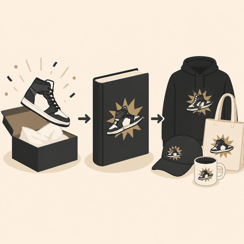
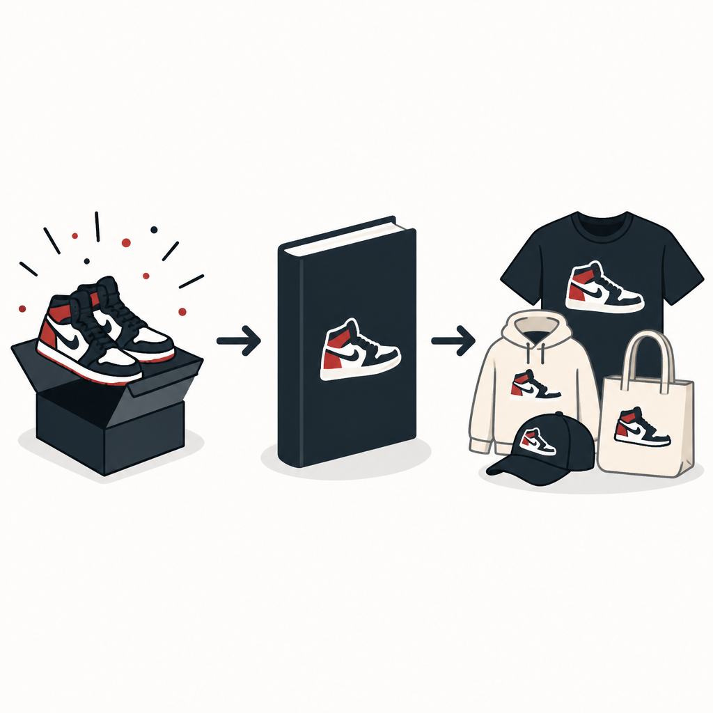
Book 2 turns a sneaker drop into merch
Devin Booker’s McDonald’s Book 2 rollout adds shirts and hats, and I break down how the collab is built to copy.
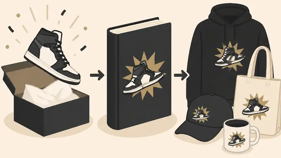
I break down how Booker’s Book 2 drop became a merch play you can copy.
I've been watching athlete collabs get louder for years, and most of them still feel weirdly lazy. A shoe drops, a photo dump goes up, maybe a vague “culture” caption, and that’s it. The whole thing is supposed to feel bigger than product, but half the time it reads like a licensing deal with better lighting. This Devin Booker and McDonald’s rollout is different in a way I actually care about, because it doesn’t stop at sneakers. It turns the Book 2 launch into a little ecosystem: shoe, apparel, pop-up, local moment, global reach. That’s the part that finally makes the collaboration feel like a story instead of a SKU.
What caught my eye in Burn City Sports’ report was the surprise merch layer. Not just the shoe, not just the brand mashup, but shirts and hats that carry the same visual language. That’s the move I wish more teams and creators would understand. If the product can’t travel beyond the product, the whole campaign dies in the feed. Booker’s camp seems to get that. They’re not just selling a shoe; they’re selling a recognizable world around it.
Source-wise, this comes from Wendy Lopez’s Burn City Sports piece, “Devin Booker’s McDonald’s collab evolves into surprise merch along with Book 2 launch”. The article doesn’t give me view or bookmark numbers, so I’m not inventing any. I’m just pulling apart the mechanics of the rollout and why it works better than the usual celebrity-brand handshake.
Stop treating the shoe like the whole campaign
Get the latest AI news in your inbox
Weekly picks of model releases, tools, and deep dives — no spam, unsubscribe anytime.
No spam. Unsubscribe at any time.
“Devin Booker’s ‘Book 2’ collaboration with McDonald’s is expanding beyond sneakers to include lifestyle merchandise, such as T-shirts and hats, blending sportswear and pop culture.”
What this actually means is Booker’s team didn’t build a one-item release. They built a brand moment that can live in multiple forms. The sneaker is the headline, sure, but the shirt and hat are the glue. They make the collab feel wearable in more than one context, which is the difference between a collector drop and a real identity play.
I’ve seen too many athlete launches die because the whole idea was “here’s the shoe, now please care.” Fans care more when they can buy into the idea at different price points and in different settings. A hat works on a random Tuesday. A tee works at a game watch. The shoe is the flex, but the apparel is the repeat touchpoint.
How to apply it: if you’re planning a drop, don’t start with the hero item and stop there. Build one premium anchor and then add lower-friction pieces that repeat the same visual cues. The trick is consistency, not quantity. If the logo language, color palette, and story are all aligned, the merch starts reinforcing the launch instead of distracting from it.
- Pick one anchor product that carries the announcement.
- Add one or two easier-to-wear items that echo the same design language.
- Make sure every item looks like it came from the same sentence, not the same printer.
The McDonald’s angle is doing more work than people think
The collaboration isn’t just “Booker plus McDonald’s” because that sounds funny on a graphic. It works because McDonald’s brings instant recognition and a weirdly useful set of symbols: the arches, Ronald McDonald, the drive-thru, the idea of a place everybody already knows. That gives the campaign a visual shorthand before anyone even sees the shoe.
That matters. When a brand has symbols everybody recognizes, the collab doesn’t have to explain itself. It can just show up. And that’s why the apparel matters here too. A shirt with the Nike swoosh and McDonald’s imagery doesn’t need a paragraph of context. It already says enough.
I ran into this same issue on a smaller project with a creator merch line. The product was fine, but the symbols were generic. Nobody could tell it apart from the next drop. Once we swapped in one unmistakable visual cue, the whole thing got easier to remember. Booker’s collab is doing that at a much bigger scale, and it’s smart because the brand pair already comes with built-in recognition.
How to apply it: when you’re pairing brands, ask what each side contributes visually, not just financially. One side should bring the audience. The other should bring the iconography. If both sides are just “cool names,” the result is mush.
- List the symbols people instantly associate with each partner.
- Use those symbols in a repeatable way across every asset.
- Don’t overload the design. One strong reference beats five weak ones.
Booker’s “Valley” identity is the real product
The Burn City Sports piece points out that the designs lean into Booker’s “Valley” identity, which is the part I think a lot of people miss when they talk about athlete branding. The shoe isn’t only about performance. It’s about place. Booker has spent a decade in Phoenix, and that local identity has become part of his public value.
That’s why this doesn’t read like random merch. It reads like a continuation of something Booker has already been building. The Valley reference gives the collaboration a home base. Without that, the McDonald’s angle would still be fun, but it would feel more like a stunt than a chapter.
I like this because it’s the opposite of empty “global lifestyle” talk. It starts local, then expands outward. That’s usually how the durable stuff works. Fans in Phoenix get the hometown signal first. Everybody else gets the style signal. Both audiences can read it without the campaign having to scream.
How to apply it: if your project has any geographic, cultural, or community anchor, use it. Don’t sand it down to make it more universal. The more specific the local reference, the more believable the broader appeal tends to be.
The pop-up is the point, not just a retail stunt
The article says there was a pop-up in Sedona giving fans a chance to get the shoe before it hits shelves around the world. That’s not just distribution. That’s theater. And yes, I mean that in a good way. The location, the timing, and the scarcity all work together to make the release feel like an event instead of inventory.
Pop-ups only work when they do something the website can’t. In this case, they create a sense of place and urgency, and they turn the product into a memory. If somebody drove to Sedona for this, they didn’t just buy a shoe. They bought a story they can retell.
The article also mentions another activation in China, which tells me the rollout wasn’t built for one market. It was built to travel. That’s a useful reminder: you can make something feel local and still design it for global circulation. Those aren’t opposites. They’re usually the same strategy done well.
How to apply it: use physical activations when you need the audience to feel the product, not just see it. Choose a location that adds meaning. Then make sure the event gives people something they can’t get from an online checkout page.
- Pick a place with a story, not just a convenient address.
- Use the event to reveal something unavailable elsewhere.
- Design one photogenic detail that will carry the campaign online.
Why the apparel matters more than the hype cycle
The surprise T-shirts and hats are doing the boring but important work. They extend the campaign’s shelf life. Sneakers get the spike. Apparel keeps the conversation moving after the spike.
This is where a lot of collabs get clumsy. They spend all their energy on the announcement and none on the follow-through. Then the internet moves on in 48 hours. Booker’s rollout seems built to avoid that. The apparel gives fans another entry point, and it gives the campaign another reason to be posted, worn, and remembered.
I also think this is the part that makes the whole thing feel more like a real brand system. The shoe says “launch.” The shirt says “membership.” The hat says “I’m still in this.” That’s a much better structure than a one-and-done novelty item.
How to apply it: build your launch so the first wave is not the last wave. Use apparel, accessories, digital assets, or behind-the-scenes content to keep the story alive after the main drop. If the campaign only works on day one, you didn’t build a campaign. You built a calendar reminder.
Booker is selling continuity, not just novelty
What I keep coming back to is continuity. Booker has moved from being “the Suns guy” to being someone who can anchor fashion, footwear, and cultural collaborations without it feeling forced. That’s not accidental. It comes from repeating the same identity signals over time until people recognize the pattern.
The Burn City Sports piece frames this as athlete-driven collaborations evolving into multi-platform branding efforts, and that’s exactly right. The important part is not that Booker did a collab. It’s that the collab fits the story he’s already telling. If the next release feels like a cousin of this one, the brand gets stronger. If it feels random, the whole thing gets noisy.
I’ve learned the hard way that continuity beats novelty when you’re trying to build trust. Novelty gets the click. Continuity gets the purchase. And in a world full of loud launches, the brands that keep their shape tend to last longer.
How to apply it: define three or four identity signals you want people to associate with the project, then keep repeating them across releases. Same visual tone. Same narrative angle. Same audience promise. That’s how a collaboration turns into a system.
The template you can copy
# [Creator/Athlete] turns [product launch] into a merch system

[Creator/Athlete]’s [hero product] collaboration with [brand] is expanding beyond [main item] into lifestyle merch, including [apparel item 1] and [apparel item 2].

## What this is really doing
- The hero product gets attention.
- The merch keeps the campaign alive.
- The brand symbols make the collab instantly readable.
- The local or cultural identity gives it a point of view.

## Copy-ready rollout structure
1. Announce the hero product.
2. Reveal one or two supporting merch items.
3. Tie the visuals to a recognizable brand language.
4. Add a physical activation or pop-up.
5. Use the event to create photos, clips, and repeatable story assets.

## Design rules
- Keep the same color system across every item.
- Use one strong symbol from each partner.
- Don’t overcomplicate the graphics.
- Make the apparel wearable outside the launch week.

## Launch checklist
- [ ] Hero item ready
- [ ] Supporting merch ready
- [ ] Event location chosen for story value
- [ ] Social assets cut for short-form video
- [ ] Follow-up post planned

## Caption template
[Hero product] is just the start. [Brand] x [Creator/Athlete] also includes [apparel item 1] and [apparel item 2], built around [identity signal / location / story].

## Short version for social
[Creator/Athlete] turned a [product] drop into a full merch moment with [brand]. The shoe is the headline, but the apparel is what makes it stick.
That template is my derivative version of the strategy in Wendy Lopez’s Burn City Sports article, not a copy of the article itself. The original report is here: burncitysports.com/2026/05/29/devin-booker-previews-more-mcdonalds/. For Booker’s broader brand context, I’d also keep an eye on Nike, McDonald’s, and the Phoenix Suns because that’s the triangle making this rollout work.
// Related Articles
- [TOOLS]
Grok 4.5 hits Cursor with $2/$6 pricing
- [TOOLS]
AGT turns agent calls into governed actions
- [TOOLS]
OpenClaw v2026.7.1 turns control UI into a workspace
- [TOOLS]
OpenAI’s screenless speaker turns ChatGPT into a companion
- [TOOLS]
SCALE turns CUDA code into portable GPU builds
- [TOOLS]
2027 AI/ML internship jobs are being tracked daily