OpenClaw v2026.7.1 turns control UI into a workspace
OpenClaw v2026.7.1 rewires the Control UI, onboarding, mobile apps, and messaging so operators can work from one place.

OpenClaw v2026.7.1 turns chat, sessions, and usage into one workspace.
I've been using OpenClaw long enough to stop blaming my own setup. The problem wasn't that it couldn't do the job. It was that every day felt like I was fighting the interface just to stay oriented. I'd open a chat, then jump to Sessions, then back to Usage, then into a mobile pairing flow, then into some half-broken approval state that made me wonder whether I was missing a step or the UI was just hiding it from me. The whole thing worked, technically. But it felt like a pile of surfaces instead of one working place.
That's what made this release worth reading closely. OpenClaw's v2026.7.1 release notes are not a tiny patch note dump. They're a pretty direct admission that the old Control UI needed to behave more like a workspace and less like a collection of tabs pretending to be a product. And yes, the release also pushes hard on iOS, Android, macOS, Telegram, Slack, Discord, Apple Messages, and model support. But the real story is the same one I keep running into in agent tools: if operators can't see what is happening, they stop trusting the system.
The Control UI finally acts like one place, not five
Get the latest AI news in your inbox
Weekly picks of model releases, tools, and deep dives — no spam, unsubscribe anytime.
No spam. Unsubscribe at any time.
"The Control UI now works more like one browser workspace for conversations and parallel work."
That line is the whole release in miniature. I've seen a lot of agent dashboards that try to be clever with navigation and end up making me carry the state in my head. OpenClaw is trying to undo that. The release says chats get clearer titles, recent sessions are easier to find, and you can pin, group, rename, fork, archive, and mark read without hunting through a maze. It also says multiple sessions can sit in resizable panes and survive a reload.
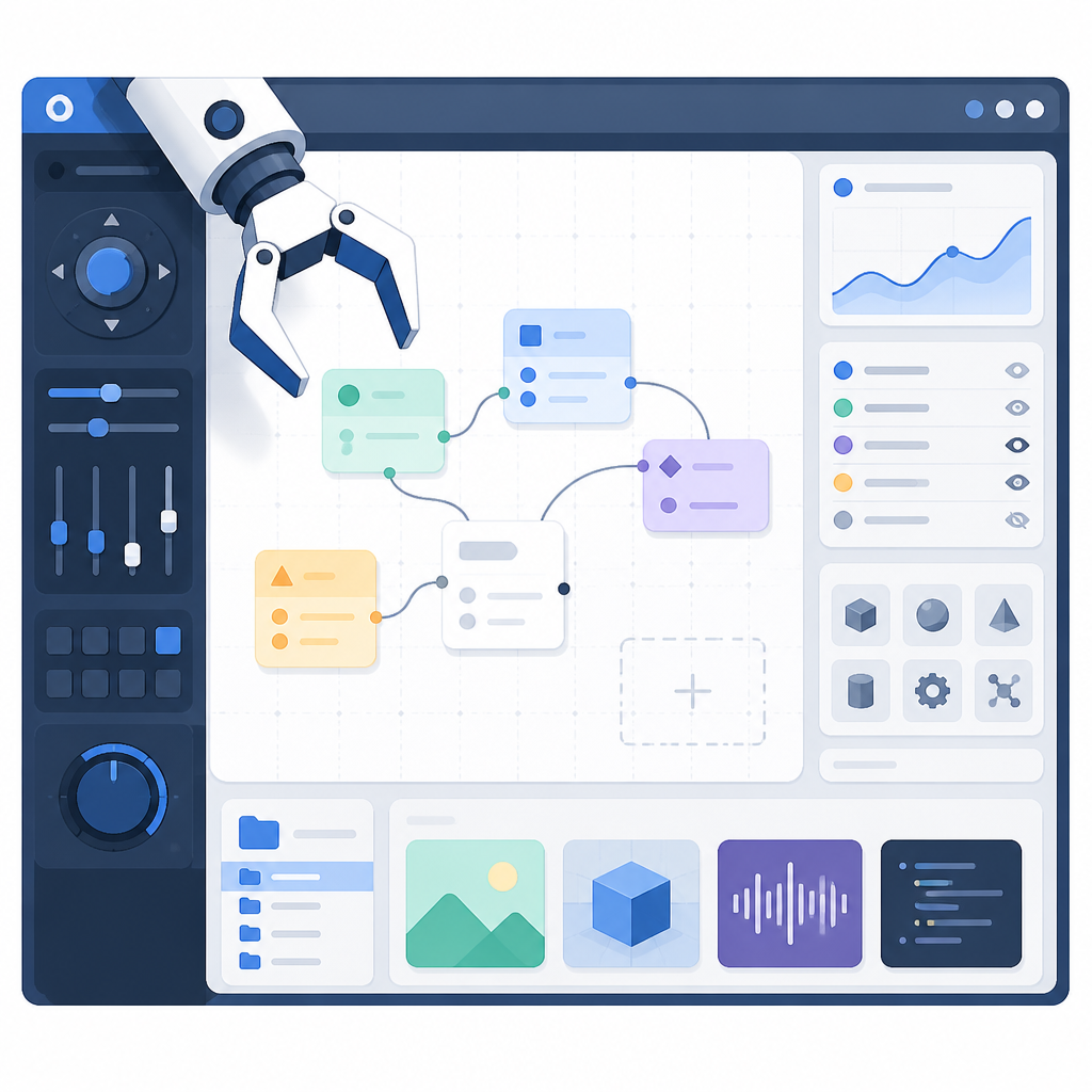
What this actually means is that the UI is no longer pretending every task is linear. Real operator work is messy. I might be comparing two runs, checking a failed approval, and keeping an eye on a long-running background task at the same time. If the product forces me to bounce between pages, I lose the thread. If it lets me keep those threads visible, I stay in control.
I ran into this exact problem when I was debugging a multi-agent workflow in a different system. The moment I opened a second tab, I lost the context of the first one. By the time I came back, the token budget had changed, the task had completed, and I was staring at a stale state with no clue what happened. OpenClaw's move toward split panes, drag-and-drop placement, and a denser Sessions page is basically an answer to that annoyance.
How to apply it: if you're designing an operator console, stop optimizing for "one page per action." Optimize for "one page per working set." Give people pinning, grouping, and split views. Make reloads preserve layout. Keep the thing dense enough that I can scan it, but not so dense that I need a second monitor just to decode it.
- Keep the active work visible while I inspect related work.
- Use stable titles and groups so the sidebar becomes memory, not clutter.
- Let me fork or archive from the same place I read the conversation.
The composer matters more than the model picker
The release spends a lot of time on the composer, and I think that's the right obsession. OpenClaw says the composer keeps attachments, model choice, voice, reasoning, send and stop state, and message actions usable across screen sizes. That sounds boring until you've used a cramped interface on a phone and realized the app has hidden the one control you need most.
What this actually means is that the input surface is being treated like a real control plane. Not a text box. A control plane. That's a useful distinction. A text box only needs to accept input. A control plane has to preserve intent while the system is thinking, streaming, waiting for permission, or asking for a microphone. The release also calls out Talk users, who can choose or refresh a microphone from settings and get readable permission guidance on narrow screens.
I've lost count of how many times I've watched a voice feature fail because the UI assumed desktop-shaped behavior. On mobile, the browser permission prompt, the audio device list, and the send state all fight each other. If the app doesn't keep those states visible, users think the model is broken when really the interface is just hiding the failure mode.
OpenClaw also notes quoted replies preserve the point being answered, and compact tool rows keep inputs, results, images, progress, errors, approvals, and steering available without overwhelming the conversation. That's the kind of detail that sounds tiny until you're trying to review a tool-heavy answer and the UI has buried the approval button under three folds of chrome.
How to apply it: design the composer around interruption. Assume the user will switch models, attach files, stop a run, or ask for voice input mid-stream. Keep those controls in one place. Make the state obvious. If a tool call is waiting for approval, don't make me scroll to find the reason.
- Expose send/stop state right next to the input.
- Keep attachments and model selection visible on narrow screens.
- Show quoted context so replies don't turn into archaeology.
Usage becomes useful when it stops hiding the math
OpenClaw's Usage work is the part I wish more agent platforms would take seriously. The release says the Usage page compares recent estimated spend and daily values without repeated reloads or hovering, shows each provider, model, agent, or channel's share, and can include provider-reported plans, quotas, balances, budgets, and Anthropic or OpenAI billing details.

What this actually means is that cost isn't being treated as an afterthought. It's part of the operating picture. That's important because agent systems can burn money in ways that are hard to notice until the bill lands. If a dashboard makes me hover for every number, or forces me to refresh to see the latest state, I'm already behind.
I like that the release also keeps seven-, thirty-, and ninety-day charts from collapsing zero-activity days. That's a small thing with a big payoff. If a chart shrinks around active days only, it lies by omission. It makes quiet periods disappear, which is exactly how you miss the real shape of usage. The release also says large all-agent reports now limit concurrent work to reduce slowdowns and memory pressure. Good. Reporting should not become the thing that breaks the dashboard.
The release adds chat-level context panels and completed-message details that show the active model, tokens, cache use, context pressure, and estimated cost. That is the kind of transparency I want when I'm deciding whether a prompt is too long, a cache is helping, or a model switch is worth the spend.
How to apply it: show cost where the action happens, not in a separate finance corner nobody opens. Tie usage to the message, the model, and the provider. Keep historical charts honest. And if your report can overwhelm the system, cap concurrency before the UI starts gasping.
Mobile pairing and desktop approvals are finally treated like real workflows
The release says paired administrators can create a mobile setup QR or copyable code from Control UI Nodes and use it to connect the official iOS or Android app. That is the kind of onboarding detail that sounds simple and is usually a pain in the neck to get right. If you've ever tried to pair a device from a cramped admin screen, you know the failure modes: bad QR placement, unclear next steps, and a browser state that doesn't survive the transition.
OpenClaw also calls out desktop-node approvals, linked GitHub work, workspace files, scheduled jobs, worktrees, Workboard items, and background tasks becoming available closer to the conversation. That's a very specific choice. Instead of making the operator go hunt across separate modules, the system is pulling the relevant objects into the same working area.
What this actually means is that onboarding and task execution are being treated as one continuous flow. That's the part people usually get wrong. They build onboarding as a marketing path and operations as a product path. Then users finish onboarding and immediately fall into a different mental model. No wonder they get lost.
I ran into this with a team rollout where pairing a device, approving a desktop node, and finding the right workspace file all lived in different places. People didn't need more documentation. They needed the steps to appear in the order they were actually doing them. OpenClaw seems to understand that a little better in this release.
How to apply it: collapse setup, trust, and execution into one journey. Keep pairing artifacts visible in the same place as the thing they unlock. If a user needs to approve something, show the object, the reason, and the next step together. Don't make them chase the state across pages.
Messaging channels are getting less bolted-on
This release doesn't just polish the core UI. It also says Telegram, Slack, Discord, and Apple Messages each receive substantial updates. That's the kind of line I trust more than a vague "integrations improved" note because it tells me the team actually went into the channel-specific mess and fixed real behavior.
What this actually means is that OpenClaw is treating external channels as first-class surfaces, not just pipes for forwarding text. In agent systems, that's a big deal. Telegram threads, Slack channels, Discord threads, and Apple Messages all have different interaction models. If you flatten them into one generic abstraction, users feel the mismatch immediately.
Channel work matters because a lot of operators live in the channel first and the dashboard second. If the channel is noisy, unclear, or missing state, people stop trusting replies. If the platform can preserve context, titles, approvals, and follow-up cues across those channels, the whole system feels less brittle.
I like that OpenClaw also mentions better status, permissions, and next steps around mobile pairing, Gateway health, and connection failures. That's the same philosophy applied to channel work: don't just say something failed. Tell me what I can do next. If the system needs pairing, say that. If a permission is missing, say which one. If a thread is stale, say how to recover it.
How to apply it: when you support a channel, design for the channel's native habits. Threads, mentions, message edits, and quoting all matter. Keep the handoff to the dashboard obvious. And always write failure states like a human who expects the user to be busy.
The plumbing got less fragile, which is the part users notice last
The release notes also mention Gateway crash loops, scheduled work, remote browser control, workspace terminals, sessions, and goals improving. That sounds like backend housekeeping, but it's not. It's the difference between a tool that feels trustworthy and one that makes me nervous every time I leave a task running.
OpenClaw says dashboard connects and reconnects use less temporary Gateway memory, reducing false pressure warnings, and that temporary Gateway restarts and stale assets recover more cleanly. It also says path-routed Gateways keep the right destination and credentials, saved choices survive refreshes, and authentication, protocol, update, and pairing failures show more useful next steps instead of leaving the page stuck or ambiguous.
What this actually means is that the system is trying to fail in ways that are recoverable. That's a huge deal. Users can tolerate failure. What they hate is uncertainty. If a dashboard says it's disconnected but doesn't tell me whether to retry, refresh, re-pair, or wait, I don't know whether I'm fixing a glitch or making it worse.
One of the more practical changes here is the cleanup around focus, contrast, assistive labels, copying, scrolling, and touch targets. Those are the kinds of fixes that don't make for flashy screenshots, but they do decide whether the product feels like it was built for actual humans or just demo videos.
How to apply it: audit your error states and recovery paths. Make sure the UI tells users whether a problem is transient, permission-related, or configuration-related. Preserve choices across refreshes. And don't let a reconnect path consume so much memory that the recovery itself becomes the outage.
The template you can copy
# Operator workspace release note template

## What changed
- The control UI now behaves like one workspace instead of separate pages.
- Sessions can be pinned, grouped, renamed, forked, archived, and marked read in place.
- Multiple sessions can stay visible in resizable panes and survive reloads.
- The composer keeps attachments, model choice, voice, reasoning, send/stop state, and message actions visible.
- Usage shows estimated spend, daily values, provider/model share, and billing details without forcing extra reloads.
- Pairing, approvals, and connection failures now show a next step instead of a dead-end error.

## How to describe the product
Use this framing:

"The product is a working area for live agent operations. It keeps conversations, sessions, usage, approvals, and background tasks in one place so operators can stay oriented while work is in flight."

## UI copy patterns

### Good status copy
- Pairing required
- Approval needed for this node
- Reconnect available
- Microphone blocked by browser permissions
- This run is still active

### Good failure copy
- We lost the connection. Retry or re-pair to continue.
- This task is queued. You can cancel it if you have permission.
- The gateway restarted. Your layout and session state were restored.
- This channel needs admin credentials to show billing details.

### Good usage copy
- Estimated spend for today
- Provider-reported balance
- Context pressure for this reply
- Cache used in this message
- Zero-activity days included in the chart

## Operator workflow checklist
- Keep the active conversation visible while inspecting related sessions.
- Preserve layout after reload.
- Show model, tokens, cache, and cost near the message.
- Put pairing and approval actions next to the object they affect.
- Make recovery steps explicit in every error state.
- Support mobile layouts without hiding the main controls.

## Release note paragraph template
"This release turns the Control UI into a single working surface for chats, sessions, usage, approvals, and background tasks. It also improves mobile pairing, channel-specific messaging, and recovery from connection and Gateway failures, so operators can keep working without losing context."

## Changelog template
### Control UI
- Added split panes for parallel sessions.
- Improved sidebar titles and session grouping.
- Added clearer composer controls across desktop and mobile.
- Expanded usage visibility with provider, model, and billing data.

### Mobile and desktop
- Added QR and copy-code pairing flows.
- Improved microphone selection and permission guidance.
- Kept approvals and task status closer to the conversation.

### Reliability
- Reduced memory pressure during reconnects.
- Improved recovery after Gateway restarts.
- Clarified auth, protocol, update, and pairing failures.

## One-sentence summary
OpenClaw v2026.7.1 turns the Control UI into a workspace that keeps conversations, costs, approvals, and recovery paths visible while work is in flight.
If I were turning this release into my own product note, I'd steal that structure and rewrite the nouns. The important part is not the exact phrasing. It's the pattern: state what changed, name the operator workflow, list the recovery paths, and keep the usage/cost story close to the action.
That's the lesson I keep taking from this release. OpenClaw isn't just adding features. It's reducing the number of times I have to remember where I am, what failed, and what to do next. That's the kind of improvement you feel immediately, even if nobody outside the people using it every day notices.
Source attribution: I based this breakdown on the OpenClaw release notes at https://docs.openclaw.ai/releases/2026.7.1. The analysis, framing, and template above are my own rewrite and are not copied from the docs.
// Related Articles
- [TOOLS]
OpenAI’s screenless speaker turns ChatGPT into a companion
- [TOOLS]
SCALE turns CUDA code into portable GPU builds
- [TOOLS]
2027 AI/ML internship jobs are being tracked daily
- [TOOLS]
MiMo Code Is Worth Using Only If You Treat It Like Infrastructure
- [TOOLS]
Ollama raises $65M with 14 people and 8.9M users
- [TOOLS]
Databricks lets you query foundation models