Midjourney turns prompt ideas into art
I break down Midjourney’s 2026 review into a copyable workflow for prompts, styles, and team image generation.

Midjourney used to mean fiddly prompting; now it means a repeatable image workflow.
I've been using Midjourney long enough to remember the annoying part: you’d get something gorgeous, then spend the next ten minutes trying to explain why it was still wrong. The faces were close, the lighting was close, the composition was close, and somehow “close” was the whole problem. It felt like the model wanted to impress me more than follow me. That’s fine for a demo. It’s useless when I’m trying to ship a campaign visual or a concept board that has to match a brief.
What finally changed my opinion wasn’t some dramatic new interface trick. It was the slow shift from “beautiful but slippery” to “beautiful and controllable.” Midjourney’s newer versions, especially V6.1 and the current V8.1 default, make me feel like I’m directing a junior art team instead of arguing with a generator. I still get the occasional weird hand or overcooked texture, because of course I do, but the output is now predictable enough that I can build a process around it instead of treating every render like a lottery ticket.
That’s why the AI Agent Square Midjourney review caught my eye. It’s not a fan post. It’s a practical review with a score, pricing, and the tradeoffs spelled out. The review says Midjourney scores 9.3/10 overall, with especially high marks for image quality, and it also calls out the parts that still annoy me: no free tier, weaker text rendering than some rivals, and limited editing. That mix of praise and irritation is exactly the right frame.
Midjourney stopped being a toy and started acting like a tool
Get the latest AI news in your inbox
Weekly picks of model releases, tools, and deep dives — no spam, unsubscribe anytime.
No spam. Unsubscribe at any time.
“Still the benchmark for AI image quality — Midjourney V8.1 produces photorealistic and artistic results that competitors consistently fall short of matching.”
What this actually means is simple: Midjourney is still the thing I reach for when I care more about the image than the interface. I’ve tried the obvious alternatives too, like OpenAI image generation in ChatGPT, Adobe Firefly, and Stable Diffusion. Each one has a lane. Midjourney’s lane is aesthetic consistency. It gives me images that look like someone made decisions, not like a model dumped pixels on the page.
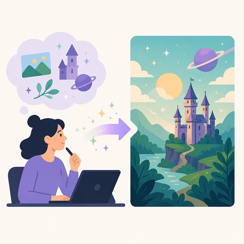
The AI Agent Square review says Midjourney has held its lead because it focused on image quality instead of chasing every adjacent feature. That tracks. I’ve watched teams waste time picking tools by the wrong metric. They ask, “Which one is cheapest?” or “Which one has the biggest feature list?” and then wonder why the outputs need another hour of cleanup. Midjourney’s value is that it reduces the cleanup.
How I apply that in practice is boring but effective. I use Midjourney for the first 80 percent of visual direction, not the last mile of production polish. If I need concept art, ad moodboards, editorial illustrations, or a strong visual direction for a landing page, it’s usually the fastest path to something usable. If I need precise typography inside the image or pixel-perfect edits, I switch tools. That boundary saves me from expecting the wrong thing from the model.
V6.1 fixed the part that made me swear at the screen
“V6.1, released in mid-2024, represented a major step forward in prompt adherence, human anatomy accuracy, texture realism, and text rendering within images.”
This is the part that matters more than people admit. Prompt adherence sounds dry until you’ve spent 20 minutes trying to get a specific composition and the model keeps freelancing. Midjourney used to drift toward “artistically acceptable” instead of “brief compliant.” V6.1 tightened that up. The review says it improved prompt fidelity, faces, hands, textures, and camera-style cues. That’s not trivia. That’s the difference between usable and annoying.
I ran into this on a product mockup project where the client wanted a “clean studio shot with a matte black object, soft side lighting, and negative space on the right.” Old Midjourney would give me a gorgeous object, then fill the empty space with drama I never asked for. V6.1 got much closer to the actual layout. It still needed a couple of passes, but I wasn’t fighting the model’s personality anymore.
My rule now is to write prompts like a set designer, not like a poet. I specify subject, environment, camera angle, lighting, material, and composition. Then I keep a small prompt library for repeatable looks. If I need a brand family to feel coherent across ten images, I don’t improvise every time. I reuse the same structure and swap only the subject details. That’s how Midjourney becomes a workflow instead of a guessing game.
- Lead with the subject and the shot type.
- Add lighting and material cues before style adjectives.
- Use fewer decorative words when you need literal output.
- Save prompts that already matched your brand tone.
The parameter system is the real product, not the pretty button
“--ar sets aspect ratio; --stylize controls how heavily the AI applies its aesthetic interpretation versus literal prompt following; --chaos introduces variability; --quality adjusts generation time and detail; --tile creates seamless repeating patterns.”
This is where Midjourney gets serious. The parameters are the part that turns a nice image generator into something I can actually direct. The review calls out --ar, --stylize, --chaos, --quality, --tile, plus --style and --sref. That’s the control surface. If you ignore it, you’re basically driving with one hand on the wheel.

What this actually means is that I can decide how much the model should interpret versus obey. That matters because not every job wants the same amount of “art.” For a hero image on a campaign page, I’ll often allow more stylization. For a product concept or a board for stakeholders, I want tighter adherence and less chaos. I don’t want the model “surprising” me when I’m making decisions under deadline.
I’ve found that teams get better results once they treat parameters like presets. Don’t make every designer remember ten knobs. Make three or four house presets and stick them in a shared doc. One preset for editorial, one for product concepts, one for social content, one for pattern work. Then people can move fast without rediscovering the same settings every week.
--ar 16:9for banners, decks, and web headers.--ar 1:1for social and square assets.--tilefor backgrounds, textures, and repeat patterns.--srefwhen you need style continuity across a series.
The web app finally removed the Discord tax
“The dedicated midjourney.com web interface provides a proper image management experience: organised collections, generation history, easy re-running of past prompts, and a cleaner creative environment than Discord.”
I’m glad this changed, because Discord was always the weirdest part of the story. It worked, technically. That doesn’t mean it was good. For a solo hobbyist, maybe fine. For a team trying to manage assets, prompts, and revisions, it was a mess. The web interface is the difference between “chat log with images” and “actual workspace.”
The AI Agent Square review points out the useful bits: collections, history, reruns, and a cleaner environment. That’s the stuff I care about when I’m iterating. I want to find the prompt that worked, clone it, tweak it, and compare versions without scrolling through a swamp of unrelated messages. I also want a place where non-technical teammates don’t feel like they need a Discord survival guide just to review a concept.
My practical advice is to use the web interface as the source of truth and treat Discord like legacy plumbing. If your team is still sharing prompts in chat, stop doing that. Put the winning prompt in a doc, tag the version, and save the output set in a shared collection. Otherwise you’ll end up recreating work because nobody remembers which prompt produced the good one.
If you’re building around the web app, keep your naming conventions strict. I use project names, date stamps, and intent labels. It sounds fussy until you have six campaigns and three art directions all called “final_final2.” Then it becomes obvious why a little discipline beats a pile of screenshots.
Commercial rights are good enough, but not magic
“All paid Midjourney plans include commercial usage rights for generated images, subject to the terms of service.”
This is one of the reasons Midjourney keeps showing up in real work. The paid plans include commercial usage rights, and for a lot of marketing, editorial, and concept work, that’s enough. But I don’t pretend that means every legal question is solved. It isn’t. The review is honest about that, which I appreciate.
If I’m working with a team that has a cautious legal department, I still pause here. Adobe Firefly is the safer conversation when someone wants stronger contractual comfort and licensed-source positioning. If I’m just trying to move a campaign draft forward, Midjourney is usually the better output engine. Those are different jobs, and people keep pretending they’re the same.
How I apply this is to separate “can we use it?” from “should we use it here?” Paid rights are a starting point, not a universal answer. For internal mockups, concept art, and social drafts, Midjourney is easy to justify. For sensitive public-facing work, I’d still have the legal and brand teams weigh in before anything ships. That’s not me being cautious for sport. That’s me avoiding a very dumb email later.
One more thing: the review notes that enterprise/API access is separate. That matters if you’re thinking about automation, internal tools, or product workflows. Don’t assume the standard subscription gives you a developer-friendly API. If you need programmatic access, you’re in enterprise territory and should plan accordingly.
The weak spots are still the weak spots
“Text within images still lags GPT-5.5 native image generation, limited editing capabilities, and no native API access on standard plans.”
I like Midjourney, but I’m not going to pretend it’s perfect. It still struggles with readable text inside images. It still isn’t my first choice when I need precise regional editing. And if I’m building a product feature or a workflow that needs API access, the standard plans won’t get me there. These are real limitations, not footnotes.
The review also calls out the restrictive content policy, especially around public figures. That’s another practical constraint. If your use case depends on flexibility there, you may find Midjourney too narrow. I’ve seen teams assume the best image generator is automatically the best business tool. That’s how people get surprised by policy blocks at the worst possible time.
My workaround is to choose the tool by the output constraint, not by brand loyalty. Need high-end visual quality? Midjourney. Need text fidelity? Consider another generator. Need local control and deep technical tuning? Stable Diffusion still has a place. Need a cleaner legal story for enterprise customers? Firefly is often the easier sell. None of that is glamorous. It is, however, how you avoid wasting afternoons.
- Use Midjourney for visual direction and concept generation.
- Use another tool when typography is part of the deliverable.
- Use enterprise channels if you need programmatic access.
- Check policy limits before you promise a risky use case.
The template you can copy
# Midjourney team workflow template

## 1) Decide the job
- Use Midjourney for: concept art, ad moodboards, editorial illustration, product direction
- Do not use Midjourney for: final typography-heavy layouts, precise regional edits, automated API workflows

## 2) Create a shared prompt structure
Subject: [what the image is]
Scene: [where it is]
Composition: [framing, angle, crop]
Lighting: [soft side light, studio, dusk, etc.]
Material/texture: [matte, glass, chrome, fabric, etc.]
Style: [photoreal, editorial, cinematic, minimalist, etc.]
Constraints: [negative space, no text, centered subject, etc.]

## 3) Use a small preset library
### Editorial preset
--ar 4:5 --stylize 150 --chaos 5 --quality 1

### Product concept preset
--ar 16:9 --stylize 75 --chaos 3 --quality 1

### Social crop preset
--ar 1:1 --stylize 100 --chaos 4 --quality 1

### Pattern / texture preset
--tile --stylize 50 --chaos 2 --quality 1

## 4) Add style consistency when needed
- Save 3–5 reference images per project
- Reuse the same prompt structure
- Use style reference parameters when you need a repeated look
- Keep one collection per project in the web app

## 5) Review and iterate
- Pick the best of four outputs
- Re-run the same prompt with one change at a time
- Save the prompt that worked
- Rename outputs with project + date + intent

## 6) Team handoff checklist
- Prompt saved in shared doc
- Output linked in collection
- Usage rights reviewed
- Legal review triggered if the subject is sensitive
- Final export moved to the design system or asset folder

## 7) Example prompt
A clean studio product shot of a matte black consumer device, three-quarter angle, soft side lighting, subtle reflections, white background with negative space on the right, premium editorial style --ar 16:9 --stylize 75 --chaos 3 --quality 1
I’d use that template as the starting point for a team playbook, not as sacred text. Change the presets to match your brand, tighten the constraints for more literal output, and keep the shared prompt structure consistent so people stop improvising their way into chaos. That one habit alone will save a lot of rework.
Source: AI Agent Square’s Midjourney review. What I added here is the developer/editor workflow framing, the practical prompt structure, and the copy-ready template; the underlying product facts and review claims come from the source article.
// Related Articles
- [TOOLS]
Ultralytics YOLO26 powers fast vision tasks
- [TOOLS]
Windsurf AI Review 2026: Best AI Code Editor?
- [TOOLS]
Awesome-LLM turns LLM research into a map
- [TOOLS]
Microsoft 365 apps steer you to MAI models
- [TOOLS]
Docker Is the Right Default for MariaDB Setup
- [TOOLS]
11 Anthropic Skills That Make Codex Useful