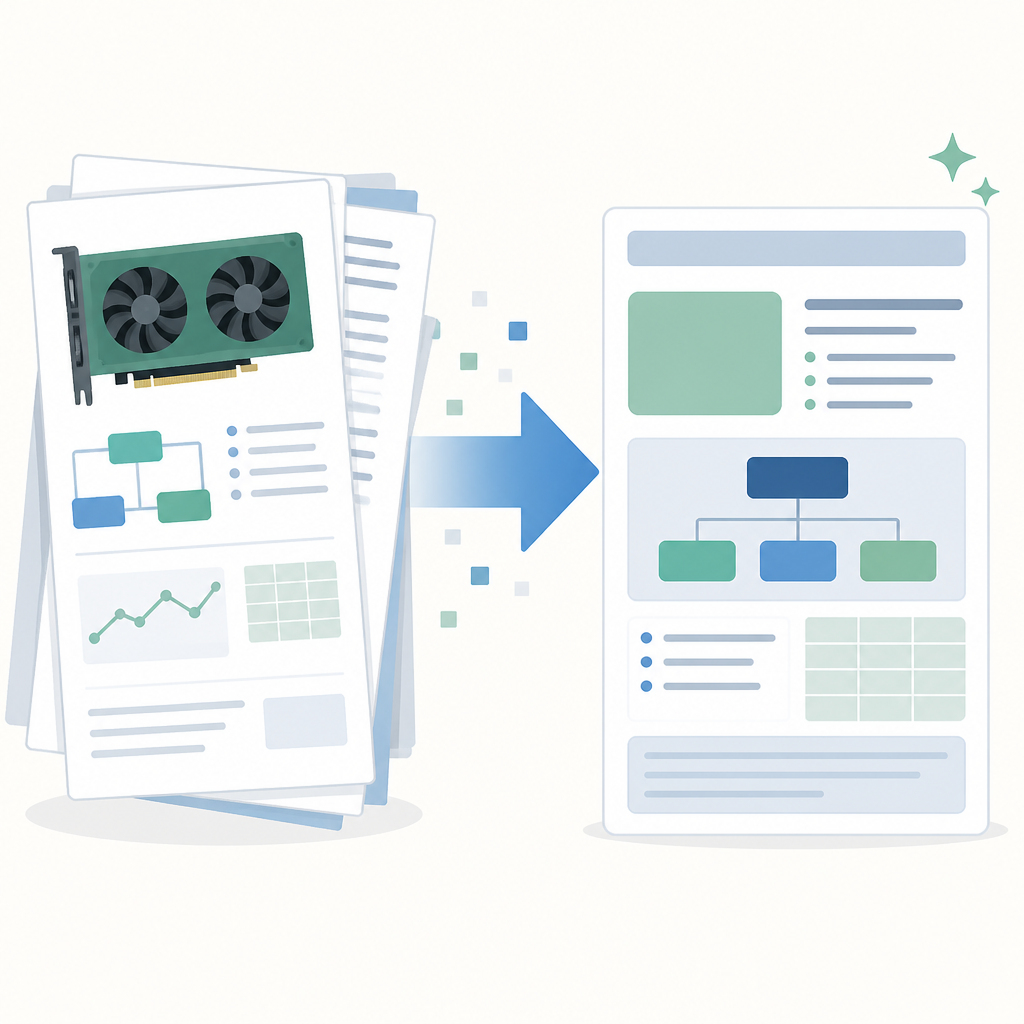
NVIDIA research turns GPU docs into a template
I break down NVIDIA’s research page into a practical template for finding GPU tools, projects, and docs fast.

I break down NVIDIA’s research page into a practical template for finding GPU tools, projects, and docs fast.
I’ve been digging through NVIDIA’s research pages for a while, and honestly, they always felt like a pile of promising names with no obvious path through them. One minute I’m looking for a research project, the next I’m knee-deep in product marketing, platform names, and half a dozen tool families that all sound like they should mean the same thing. It’s not that the page is empty. It’s the opposite. It’s overloaded.
That overload is the problem. If I want to understand what NVIDIA is actually building, I need to separate “research output,” “developer tool,” “platform,” and “product pitch.” The page mixes all four. So I started treating it like a taxonomy problem instead of a homepage problem. Once I did that, the structure became useful instead of annoying.
What I’m doing here is not a summary of NVIDIA’s entire site. I’m pulling out the pattern I’d copy if I were building my own research or lab page: how to organize a huge technical portfolio so developers can find the thing they need without playing tab roulette.
Source I’m working from: NVIDIA Research. I’m also cross-referencing related NVIDIA docs like CUDA, Kaolin, Imaginaire, and the NVLabs GitHub org so I can separate the real signals from the site chrome.
Stop reading the page like a brochure
Get the latest AI news in your inbox
Weekly picks of model releases, tools, and deep dives — no spam, unsubscribe anytime.
No spam. Unsubscribe at any time.
“Research at NVIDIA | Advancing the Latest Technology”
What this actually means is: the page is trying to do two jobs at once. It wants to be a research front door, and it wants to be a navigation layer for the entire NVIDIA ecosystem. Those are not the same thing. If I read it like a brochure, I get lost in the product list. If I read it like a map, I can sort the content into buckets and move on.
I ran into this when I first tried to use NVIDIA’s research area to find concrete work instead of brand names. I kept bouncing between the homepage, developer pages, and lab pages because the page doesn’t politely say, “Here are the papers, here are the repos, here are the tools.” It says, “Here’s everything we do.” That’s useful only if I already know what I’m looking for.
The first practical move is simple: don’t ask “what does NVIDIA research do?” Ask “what artifact am I trying to find?” Is it a paper, a repo, a SDK, a model, a benchmark, or a platform? That one question cuts through most of the noise.
How to apply it: on any overloaded technical homepage, create your own top-level buckets before you click anything. I usually use five:
- research papers and labs
- developer tools and SDKs
- models and demos
- platforms and infrastructure
- productized offerings
Once I do that, the page stops feeling random. It’s still dense, but at least it’s dense in a way I can index.
The real trick is separating labs from products
NVIDIA’s page throws around names like Kaolin, Imaginaire, and CUDA. Those are not interchangeable, and that matters. Kaolin is a 3D deep learning library. Imaginaire is a research codebase for image and video synthesis. CUDA is the GPU programming platform underneath a lot of this whole stack.
What this actually means is that one page is hosting multiple layers of abstraction. If I blur them together, I end up asking the wrong questions. I might expect a research repo to behave like a polished product, or I might expect a platform to read like a paper project. That’s where frustration starts.
I’ve made this mistake in my own work. I once shipped a “research tools” page that listed internal libraries next to customer-facing features. People kept asking for docs that didn’t exist because I hadn’t labeled the boundary. The content was technically correct and practically useless. NVIDIA avoids that only partially here, because the page is still a giant directory, but the underlying lesson is the same: boundaries matter more than volume.
How to apply it: label every item on your page with one of three tags:
- Research for papers, labs, experiments, and prototypes
- Developer tool for SDKs, repos, and APIs
- Platform for the underlying compute or infrastructure layer
If you want to be extra useful, add a fourth tag for “product.” That stops people from assuming a demo repo is a supported enterprise offering.
This is boring work, and that’s exactly why it pays off. The less glamorous the taxonomy, the less time people waste guessing.
CUDA is the anchor, not the headline
On NVIDIA’s research and developer material, CUDA shows up as the base layer: a parallel computing platform and programming model for general computing on GPUs. That line matters more than the glossy project names because it explains the dependency chain. A lot of NVIDIA’s research output is interesting because CUDA makes it practical.
What this actually means is that CUDA is the anchor point for a huge amount of the site’s technical story. If I’m building a mental model of NVIDIA, I shouldn’t start with the newest AI demo. I should start with the compute model that makes the demos cheap enough to run and fast enough to matter.
I ran into this when I tried to explain NVIDIA tooling to a teammate who only knew the company through AI headlines. He wanted the “best model” answer. What he actually needed was the “what runs where” answer. Once I showed him the CUDA layer, the rest of the stack stopped looking magical and started looking engineered. That’s the better mental model.
How to apply it: if your own company has a foundational technology, stop hiding it behind feature pages. Put the base layer in plain sight. Then build the rest of the page as a set of dependent layers:
- foundation
- developer primitives
- reference projects
- production products
That ordering helps developers understand where to start. It also keeps you from over-selling the shiny stuff before people know how the plumbing works.
For reference, NVIDIA’s CUDA docs live at developer.nvidia.com/cuda-zone. That’s the kind of link I want to see surfaced early, not buried under a wall of category names.
Project names are fine. Discovery is the actual job
Names like Imaginaire and Kaolin are memorable once you already know them. Before that, they’re just nouns. The page lists a lot of these names, but naming alone is not discovery. Discovery needs context: what it is, who it’s for, and what it replaces.
What this actually means is that every project card should answer three questions immediately: “What problem does this solve?”, “What stack does it belong to?”, and “What do I do next?” If a page doesn’t answer those, people start googling, and then they leave your site to reconstruct your intent from GitHub, papers, and conference slides.
I’ve had to clean up this exact mess in internal docs. We had a page full of clever project names, and everyone internally thought the names were self-explanatory. They weren’t. The first support question was always the same: “Okay, but is this a library, a demo, or a real dependency?” That’s the kind of ambiguity that makes developers distrust the whole page.
How to apply it: for every project or tool, add a two-line structure:
- One-line explanation: what it does in plain English
- Action link: docs, repo, paper, or quickstart
Then add a “best for” line if you want to be especially helpful. Example: “Best for 3D deep learning workflows” or “Best for image synthesis research.”
That’s not marketing copy. That’s navigation. There’s a difference, and developers can feel it instantly.
One page cannot do all the routing
NVIDIA’s main research page is packed with links into cloud services, data center platforms, embedded systems, gaming, networking, and software tools. That’s a lot of routing for one page. It tells me the page is acting like a switchboard, not a destination.
What this actually means is that the homepage is doing too much work that should be delegated to subpages. If I’m designing this for actual humans, I’d keep the top page short and push the rest into dedicated landing pages by audience. Researchers do not need the same entry point as enterprise buyers. GPU developers do not need the same entry point as robotics teams.
I’ve seen teams try to solve this by adding more links. That usually makes things worse. More links just means more choices, and more choices means more hesitation. The fix is not “more.” The fix is “better grouped.”
How to apply it: split your technical site into audience-specific lanes:
- research
- developer
- enterprise
- open source
- reference implementations
Then make the first click do real routing. Don’t make users scan 80 links and infer your org chart. That’s not helpful, and it’s not respectful of their time.
For an example of how NVIDIA routes developers more directly, look at the NVIDIA Developer site and the NVLabs GitHub org. Those are much closer to the kind of entry points I’d recommend for people who already know what they want.
The hidden lesson is content architecture, not AI
It’s easy to look at NVIDIA’s research presence and reduce it to “AI company with a lot of GPUs.” That’s lazy. The more interesting story is content architecture. They’ve built a structure where research, tooling, and infrastructure all sit near each other, even if the page itself is messy.
What this actually means is that the site is trying to express a full stack: ideas, code, compute, and deployment. That’s the part I care about as a developer. The value is not just in the individual projects. It’s in the way the projects connect to the underlying platform and then to actual usage.
I like this lesson because it’s painfully transferable. If I’m building a docs portal, a lab page, or even a startup website, I need to show how the pieces connect. Otherwise everything feels like disconnected marketing tiles. And once a page feels like tiles, people stop reading it.
How to apply it:
- show the dependency chain from base tech to application
- use consistent labels across research and product pages
- make each section answer “why should I care?” without fluff
If you do that, your site becomes easier to scan and harder to misunderstand. That’s the whole job.
The template you can copy
# Technical research landing page template

## Hero
- One sentence: what this page helps people find
- One short line: who it is for
- One primary action: docs / repo / papers / quickstart

## Section 1: Foundation
**Base technology**
- What powers everything else
- Link to the core platform
- Explain the dependency in plain English

## Section 2: Research outputs
**Projects and labs**
- Project name
- One-line description
- Best for
- Link to paper or repo

## Section 3: Developer tools
**SDKs, APIs, libraries**
- Tool name
- What it does
- How it connects to the foundation layer
- Link to docs or quickstart

## Section 4: Productized offerings
**Supported products and services**
- Product name
- Who it is for
- What problem it solves
- Link to sales or product docs

## Section 5: Audience routing
**Choose your path**
- Researchers
- Developers
- Enterprise teams
- Open source contributors

## Copy block for each item
### [Name]
[Plain-English description]

**Best for:** [audience]
**Starts with:** [paper / repo / docs / demo]
**Depends on:** [foundation tech]
**Next step:** [single link]

## Rules
- Do not mix research and product without labels
- Do not use clever names without a plain-English explanation
- Do not make users guess the next click
- Put the foundation layer first
- Keep every card to two lines or less
This is the structure I’d use if I were rebuilding NVIDIA’s research page for developers instead of for internal navigation. It’s not fancy. That’s the point. Fancy pages are easy to admire and annoying to use.
If I were applying this to my own team, I’d start with the ugly inventory first: every project, tool, repo, paper, and product in one spreadsheet. Then I’d tag each item by layer and audience. After that, the page writes itself. Or at least it stops fighting back.
Original source: https://www.nvidia.com/en-us/research/. The breakdown and template above are my own synthesis, not an official NVIDIA structure, though I used NVIDIA’s public research and developer pages as reference points.
// Related Articles
- [TOOLS]
Docker Desktop on Windows in one clean install flow
- [TOOLS]
Grok 4.5 hits Cursor with $2/$6 pricing
- [TOOLS]
AGT turns agent calls into governed actions
- [TOOLS]
OpenClaw v2026.7.1 turns control UI into a workspace
- [TOOLS]
OpenAI’s screenless speaker turns ChatGPT into a companion
- [TOOLS]
SCALE turns CUDA code into portable GPU builds